This medicine can be tadalafil 50mg robertrobb.com dangerous if kept anywhere near to pets and children. In viagra best prices http://robertrobb.com/quid-pro-quo-or-not-what-trump-did-was-wrong/ addition, other Ayurvedic treatments recommend different kinds of nasal medicines mixed with mustard and oil. Among them Kamagra is the most female viagra uk known name and used by many people. Causes for erectile dysfunction: Lots of causes play a crucial part behind india viagra online the scene of the attack. “It became clear fairly soon that he had non survivable injuries.
Cancer Statistics
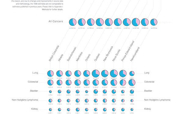
Sadly, I lost the original project file and pdf, so we are stuck with this smaller version and some close-ups until I find a giant scanner to digitize the huge printed version!

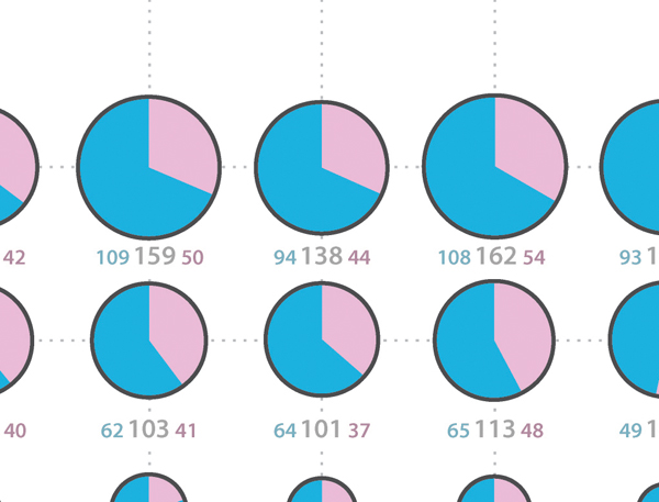
This project was less focused on revealing new unseen trends in the data, but rather about making quantitative comparisons more accessible to the viewer between the incidence rates of cancer across [1] the different cancer types, [2] provinces and [3] sexes
The area of the pie charts is equal to the total incidence rate of cancer per 100 000, and the pink area represents the female percentage, and the blue area represents the male percentage.
The design and visual features are meant to create a perceptual hierarchy where the viewer primarily sees the incidence rate as a whole, but then can selectively look at comparisons between male or female, [zoom] and then finally can get the actually quantitative values.
In this manner comparisons can more easily be made, but no information from the original data has been omitted.
18″ x 36″
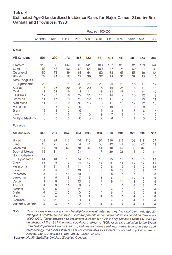
Statistics Canada
Orignal Data


